01
Brand matched
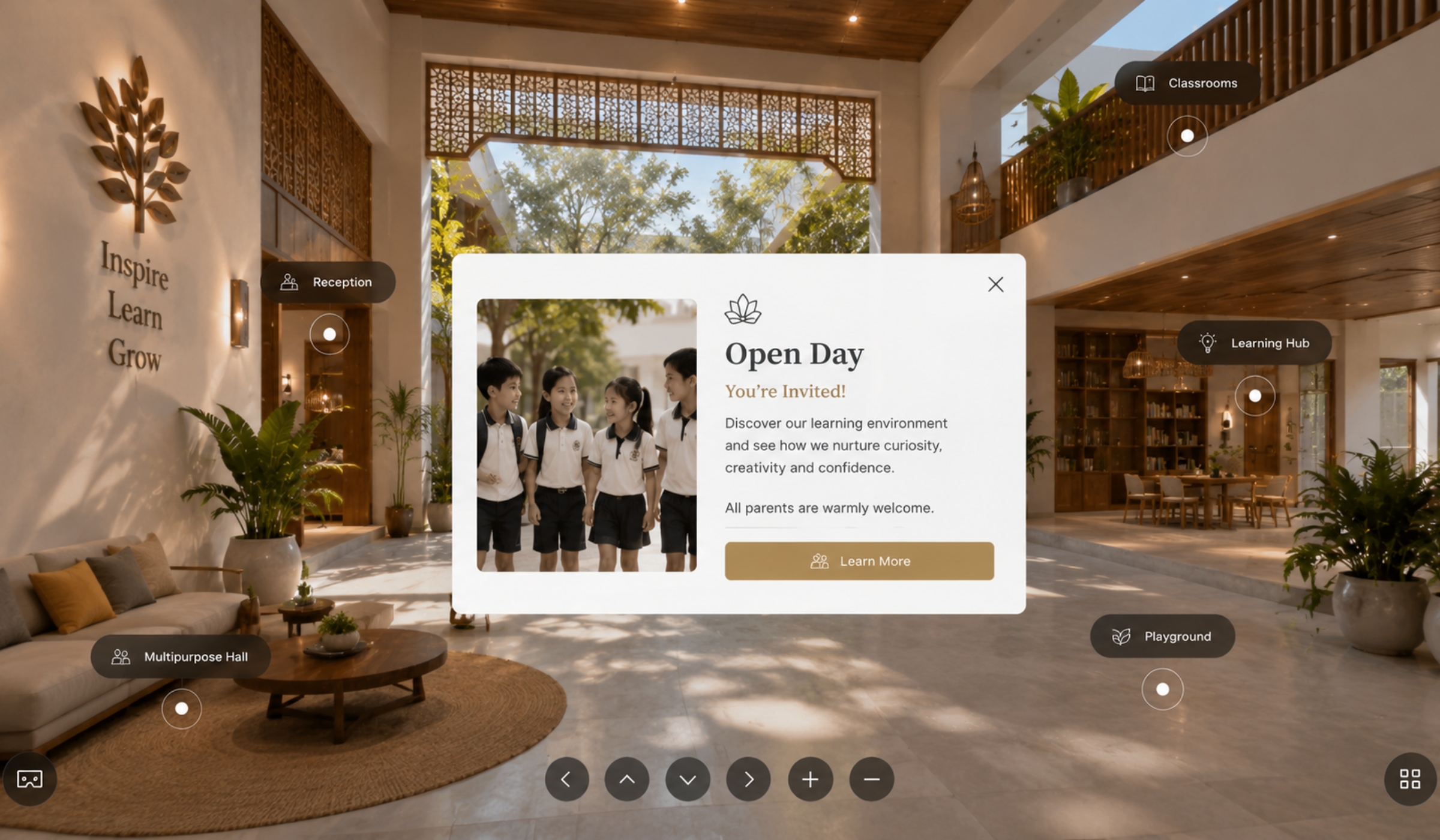
Colours, intro screens, logo placement, icons and visual styling designed to feel connected to the business itself.
A good 360 experience should feel effortless. Clean movement, useful details, subtle guidance and a stronger understanding of the space from the very first click.
This page shows how branding, labels, cards, media, guided flow and direct actions can turn a simple walkthrough into something far more useful.
The strongest tours feel calm, intentional and easy to understand. People should know where they are, what they are looking at and what they can do next without needing to think about it.
That is where the difference is. Better flow. Better guidance. Better presentation. Less confusion. Less dead ends.
Good UX inside a 360 tour is not about throwing features everywhere. It is about placing the right details in the right place without making the experience feel busy.
Colours, intro screens, logo placement, icons and visual styling designed to feel connected to the business itself.
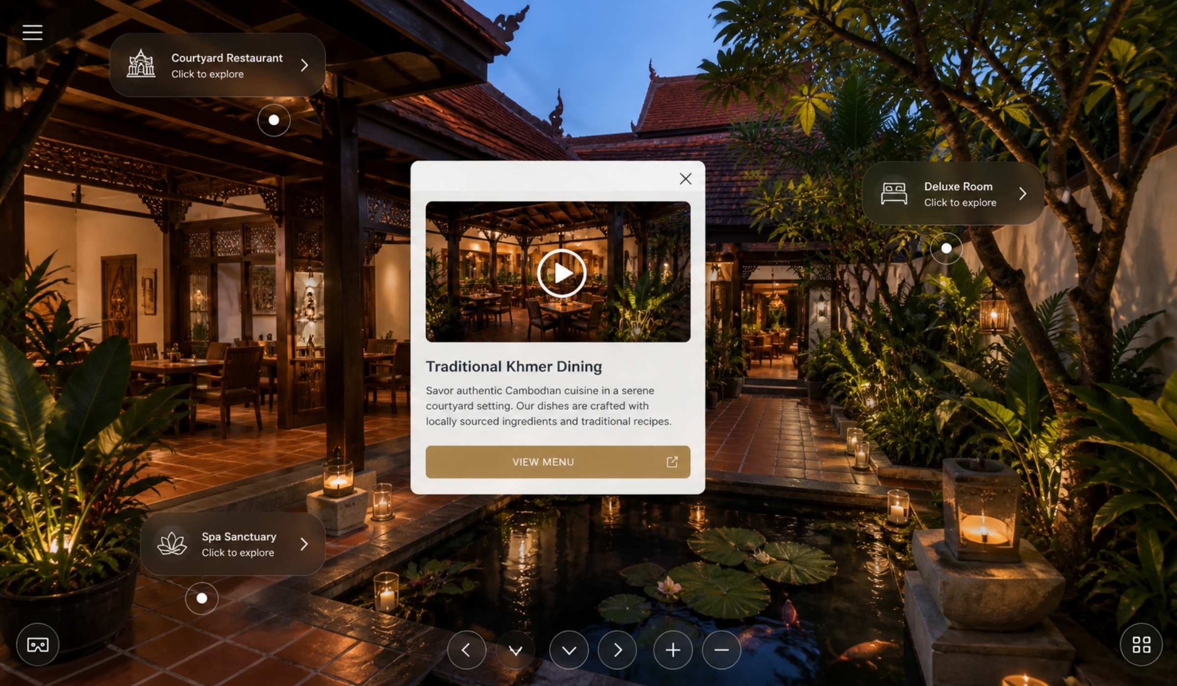
Room names, facility markers and useful notes placed carefully so people instantly understand what they are looking at.
Menus, room details, videos, offers, opening times, images and extra information opened directly inside the tour itself.
Booking links, websites, maps, Grab, PassApp and enquiry routes placed exactly where they naturally make sense.
A generic tour feels disconnected. A properly built one feels integrated into the wider brand and presentation.
The colours, cards, labels, icons and movement should all feel intentional. That is what makes the experience feel premium.
The best tours do not overwhelm people with information. They guide quietly. One useful detail at a time.
Open room details, visuals, menus, prices, videos and useful information without leaving the experience.
Smooth movement through the space with natural navigation and clearer understanding from scene to scene.
Direct routes to booking, contact, maps, websites and transport links placed where users expect them.
Designed to work cleanly across mobile, desktop and tablet without feeling cluttered or awkward.
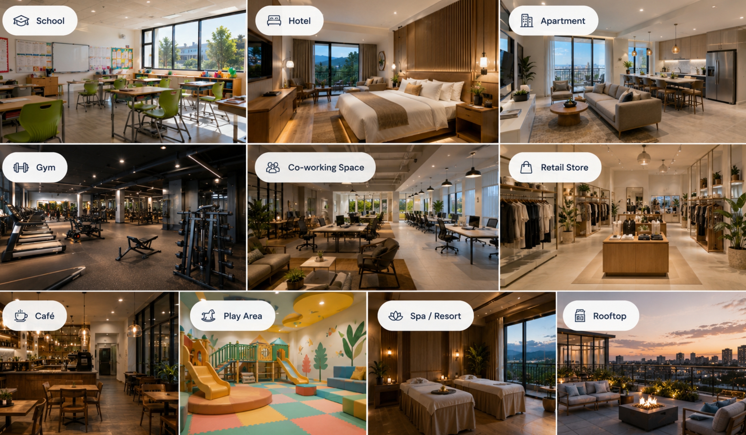
Hotels, gyms, schools, villas, venues, resorts and property all benefit when people can properly understand layout, atmosphere and movement before they arrive.
The more important the physical space is, the more valuable the tour becomes.
Every part of the tour should make the viewer more confident. Cleaner understanding leads to better enquiries and stronger first impressions.
Start with the scene that gives the clearest overall understanding of the space.
Guide movement through the space in a way that feels obvious and effortless.
Use cards, labels and media only where they improve understanding and reduce confusion.
Booking, contact and enquiry routes should always feel easy to find.
Send the location, explain what people need to understand, and we will shape the right experience around it.